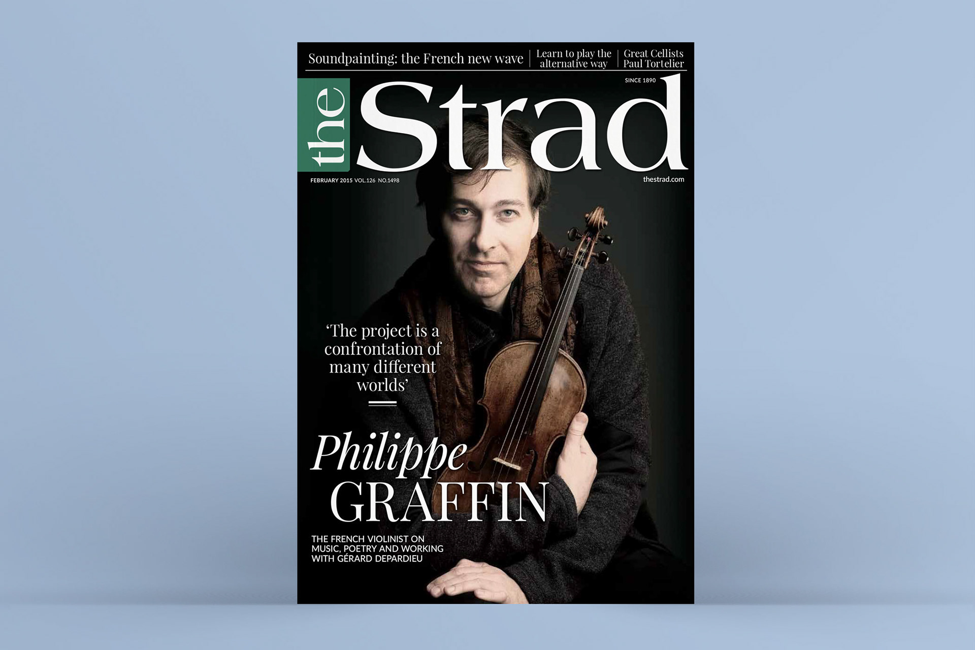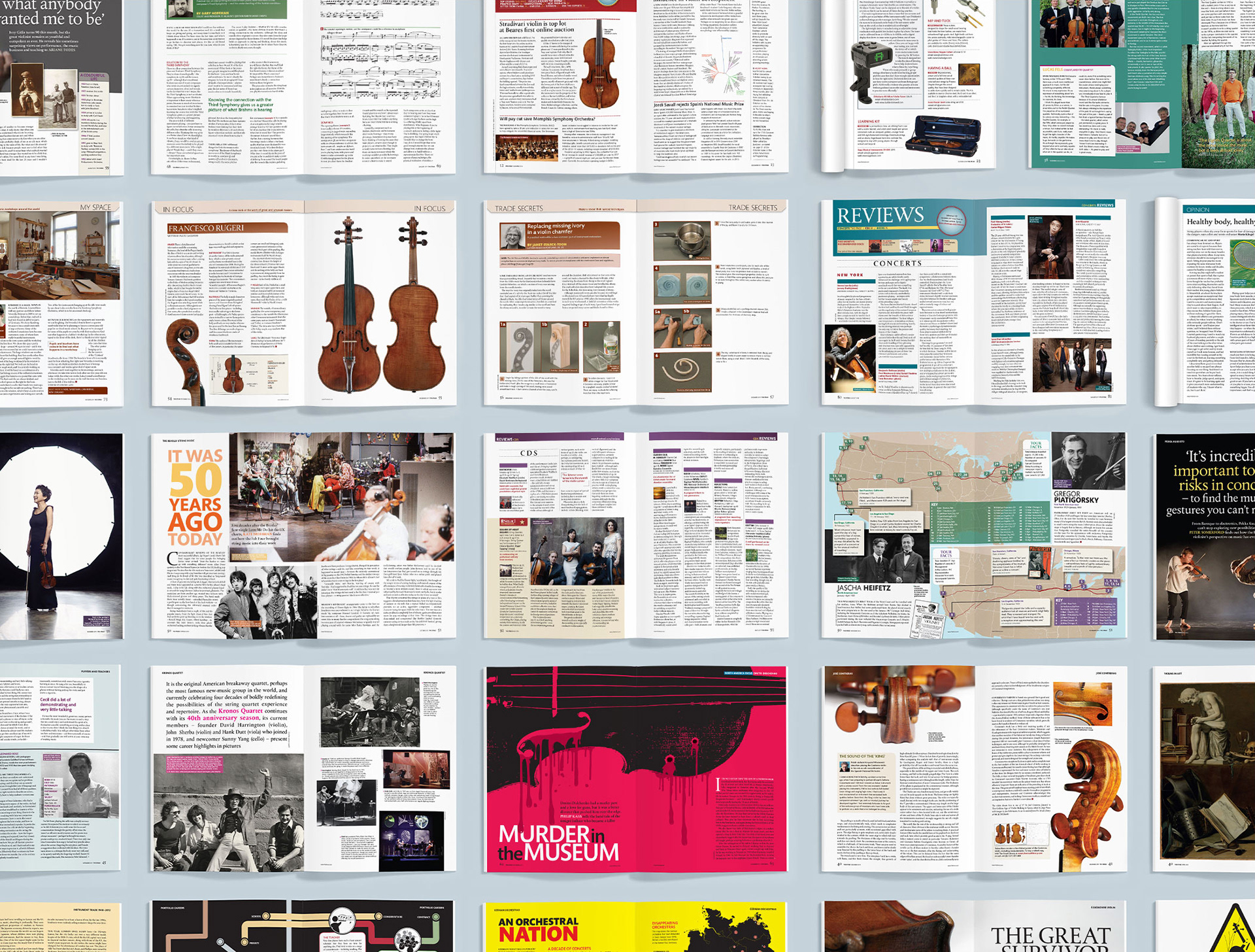
The Strad magazine, with a 134-year history, required a modern update to match its evolving content and format. The previous design, characterised by vibrant colours and creative freedom, occasionally resulted in cluttered layouts. With the introduction of new features and a goal to engage a younger audience, including students in schools and universities, a unique design approach was necessary to make the magazine more appealing and distinct.
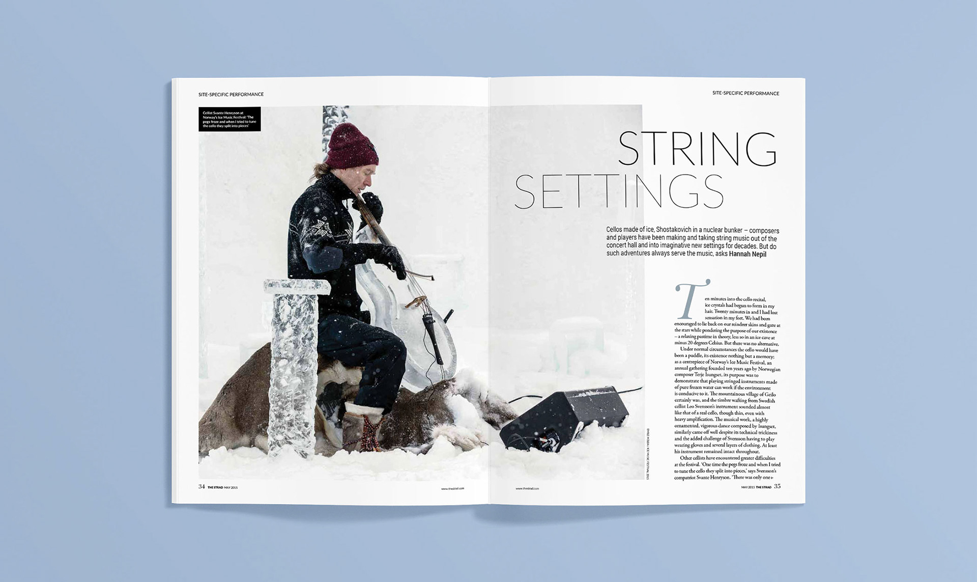
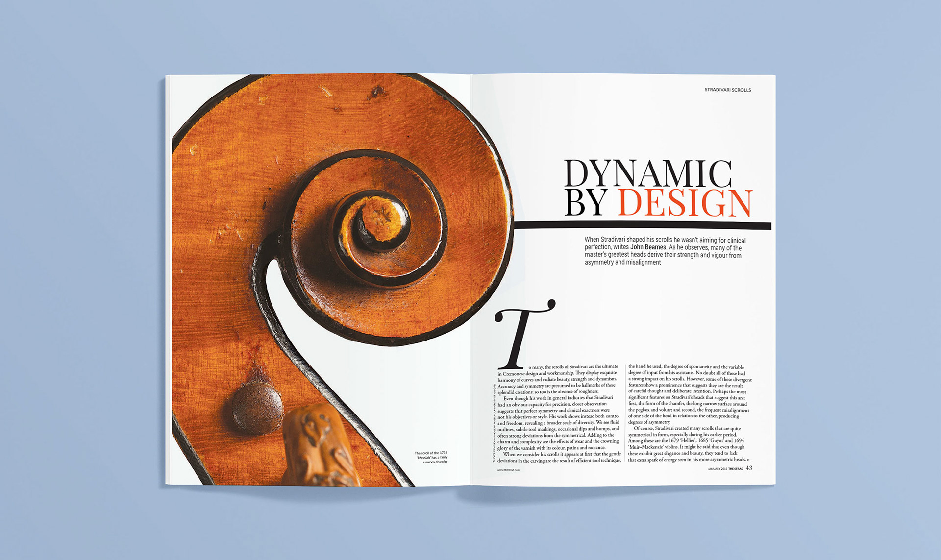
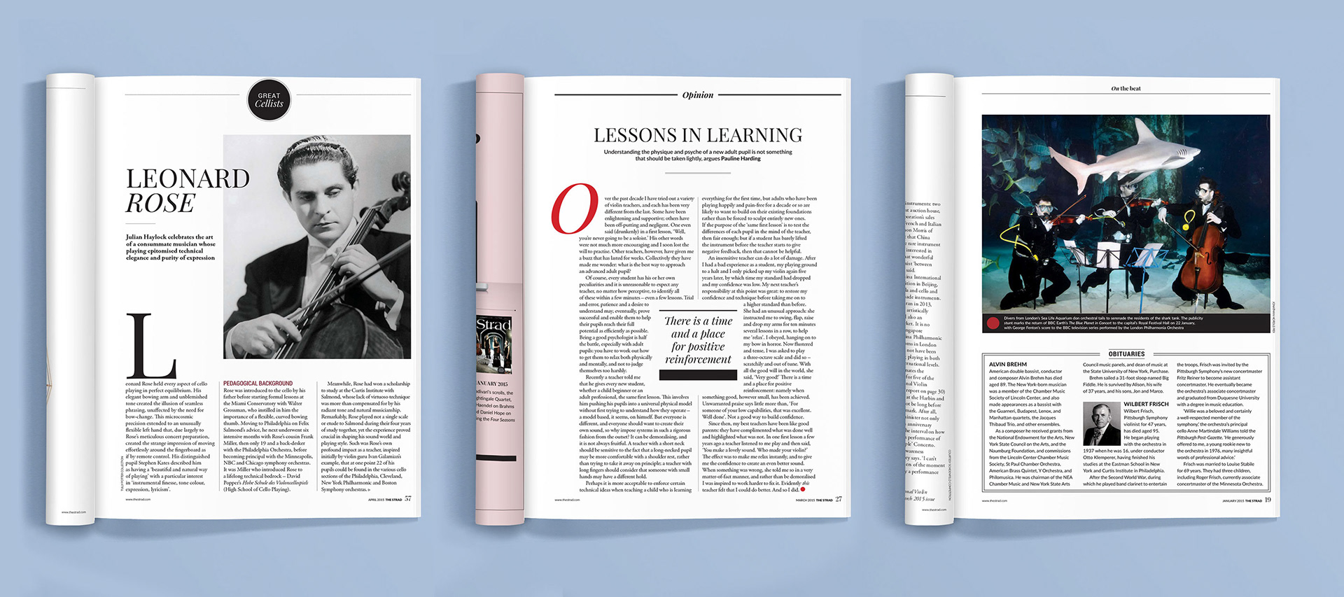
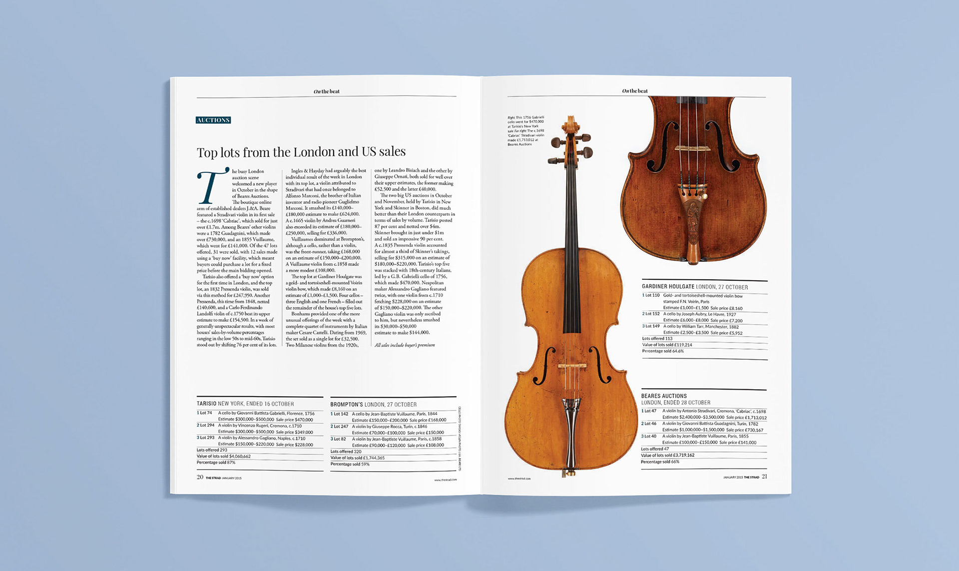
To address this, I opted for a minimalist colour palette, primarily black with touches of red, yellow, and blue-green on section pages. New fonts, Playfair Display and Lato, were chosen to ensure readability without compromising space for content. The redesign aimed for a more luxurious and niche feel.
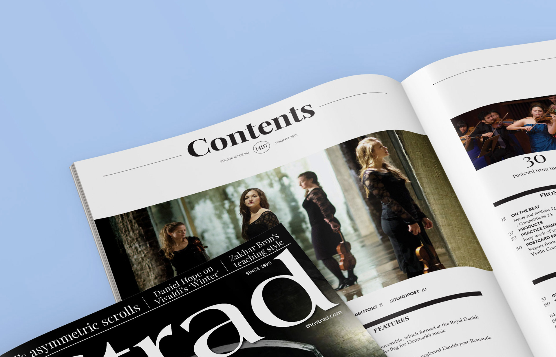
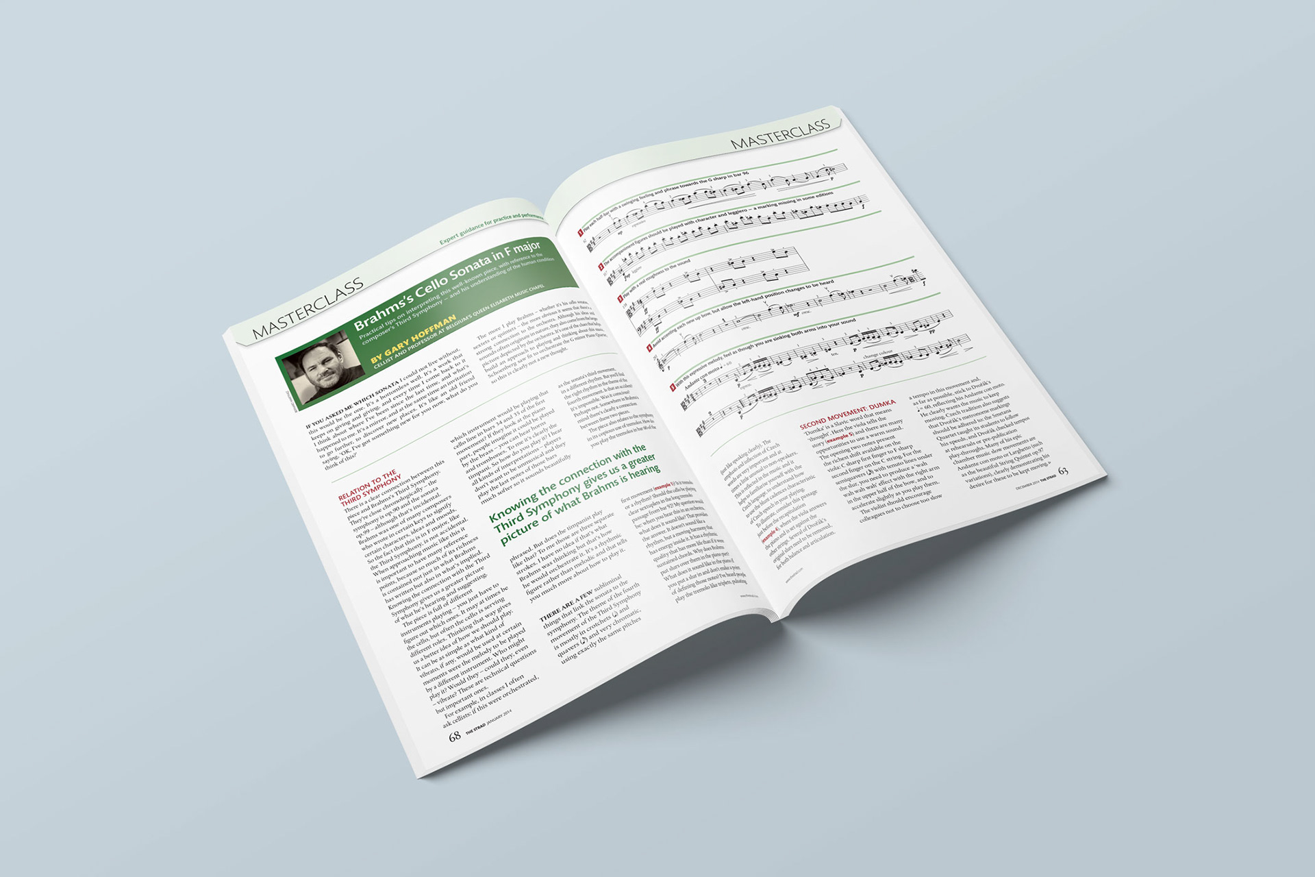
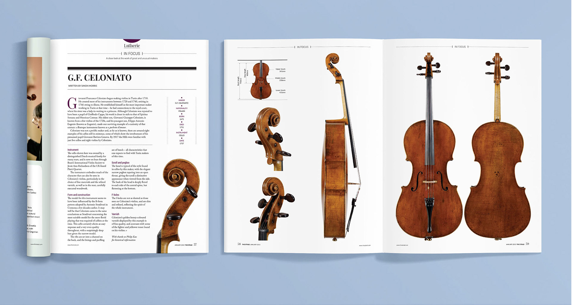
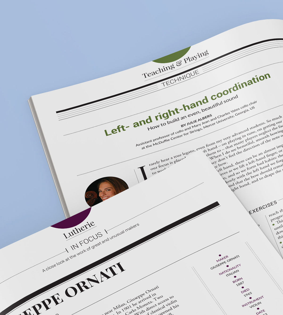
Circular icons and symbolic elements were incorporated to highlight distinct sections within the magazine. Linear treatments were also employed to differentiate sections and add variety to the magazine's pacing. This adaptable design approach allowed for easy adjustments to accommodate various features and maintain a fresh and engaging look.
The redesign's success attracted a younger readership, and it has remained effective for almost ten years, maintaining its appeal and functionality.
Category
Music
Music
Application
InDesign, Photoshop, Illustrator
InDesign, Photoshop, Illustrator
Role
Creative Direction, Ideation, Art Direction
Creative Direction, Ideation, Art Direction